Kelly + Joseph’s fresh plaid letterpress invitation suite
I know I say this about everyone, but Kelly was honestly one of my favorite clients from last year. She had a clear vision, she wasn’t afraid to go off the beaten path, and she invested in the details that take an invitation suite from ‘that’s cute’ to ‘wow!’
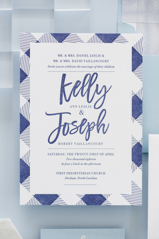
photo by Mikkel Paige, photo styling by Janet St. Clair
The standout piece of Kelly’s suite was her invitation card. We were inspired to include a buffalo plaid check, and paired with a loose script font, it was the perfect mix of classic and modern. My favorite detail was the letterpress printing - when you’re going for a simpler look, I believe that letterpress is absolutely key.
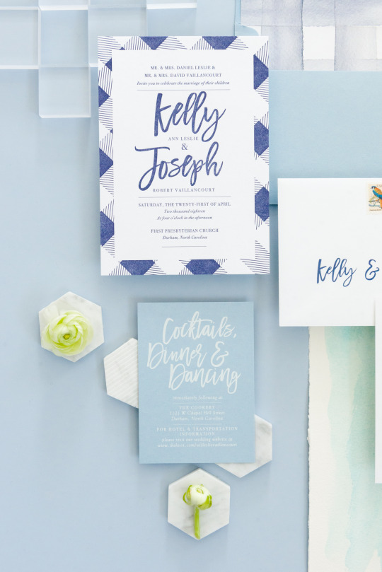
photo by Mikkel Paige, photo styling by Janet St. Clair
Sometimes clients worry that their designs are too simple and want to crowd them with additional elements. My number one piece of advice is not to bring more stuff on to the card, but instead to consider specialty printing. The subtle texture, and cotton paper give an upgraded experience that is missing if you stick with digital printing. The look will feel subtly elegant, rather than plain.
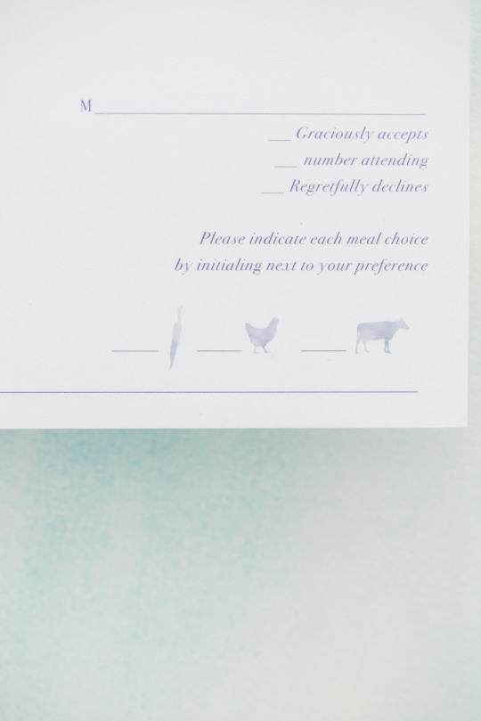
photo by Mikkel Paige, photo styling by Janet St. Clair
Kelly and Joe’s response card included cute little watercolor illustrations of their meal choices.
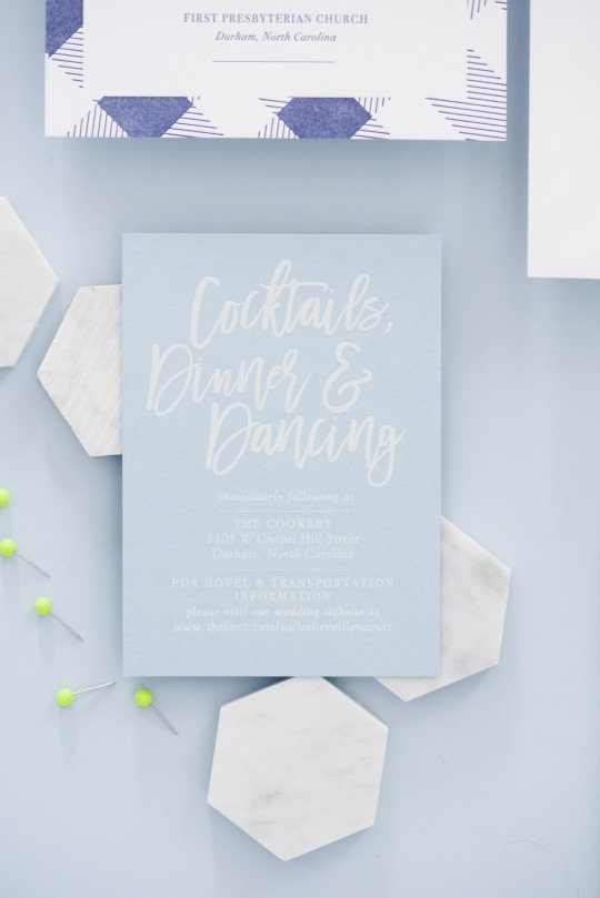
photo by Mikkel Paige, photo styling by Janet St. Clair
We kept everything from feeling too matchy by doing white ink on the reception card, which matched the outer envelope.
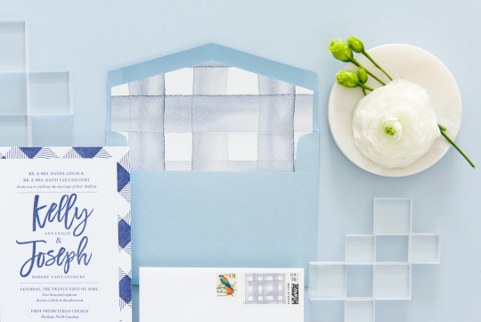
photo by Mikkel Paige, photo styling by Janet St. Clair
We brought the plaid theme through to the envelope by inserting a plaid watercolor envelope liner - giving it a more layered feel.
Kelly and Joe were so kind to work with, and I truly enjoyed getting to know them through the design process. I’m so grateful that my job lets me meet people I otherwise wouldn’t. And I get to make beautiful invitations I’m proud of to boot!