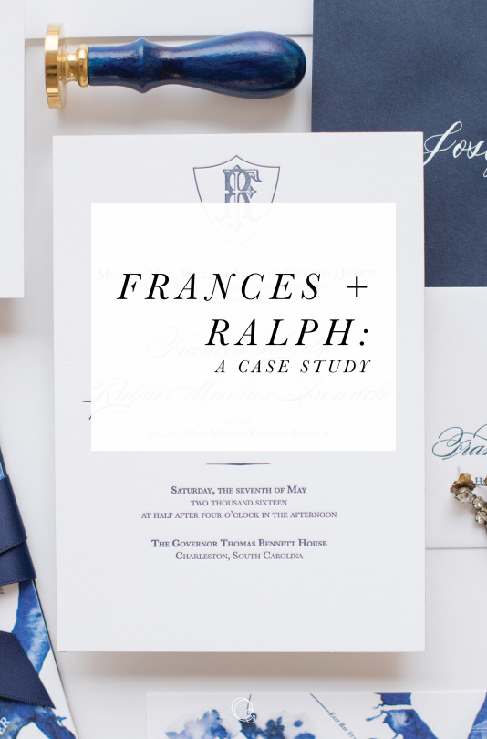
Case Study: Frances + Ralph
Frances and Ralph were such a fun couple to work with! Frances came to me over a year before her wedding, and was honestly one of the most organized people I have ever worked with - she had a vision, and I was so excited to help her realize it.
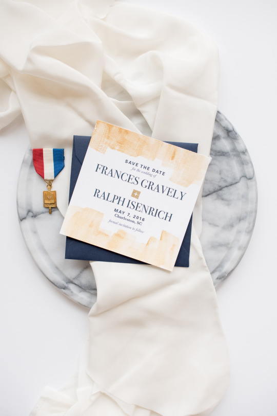
Frances wanted her Save the Date, to hint at what the invitation would look like, but also have a more handmade feel. We were really inspired by these balloons, so we incorporated a similar brush stroke pattern using gold watercolor. We also incorporated a touch of gold by embossing the plus sign between their names - a nod to Ralph’s Swiss background.
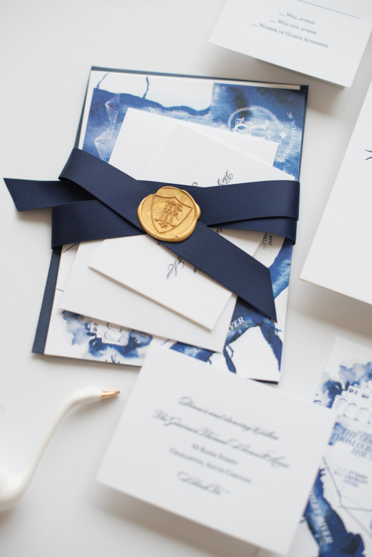
We began the invitation process with the monogram, and then moved on to designing the invitation, and secondary cards. We chose to go for a double thick invitation, with gold foil edges, which gives such a tactile feel to the suite.
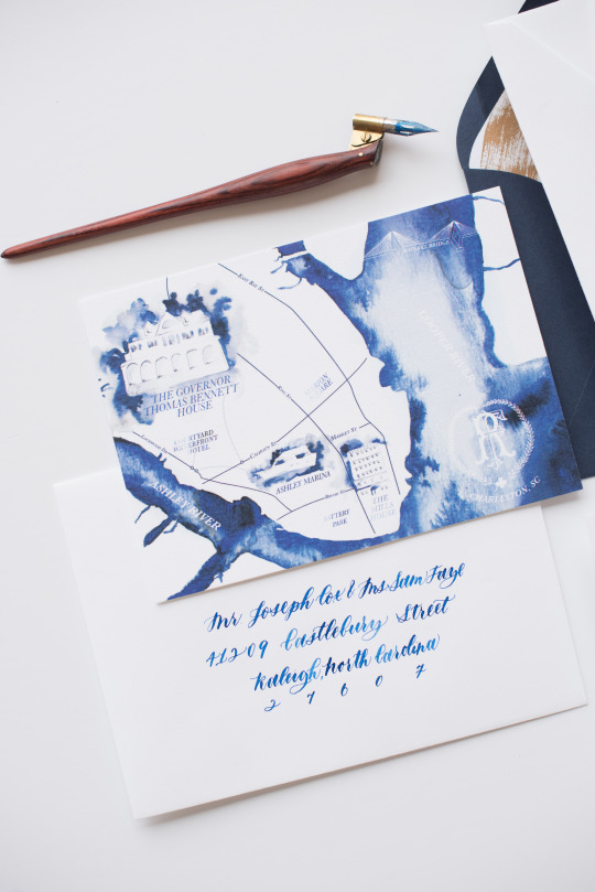
The remaining secondary cards we kept very classic, except for the map. I was inspired by the navy blues of her suite, and the fact that Charleston is so connected to the water, so I did a monochromatic watercolor map - I wanted it to look like water pooling on the paper, and the relief areas would form the shapes of the buildings and landscape.
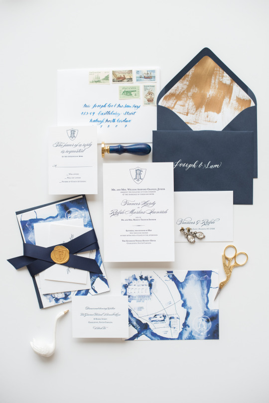
This suite is really an example of how special details can just pull the whole thing together - in addition to her Crane Lettra envelopes, we included an inner envelope that was navy, with gold calligraphy, with a gold brush stroked liner (a call back to her save the dates), and sealed with an oversize wax stamp, with her monogram. That stamp you guys. It was SO good, and really just pulled the whole thing together. Then, we finished the whole thing off with vintage stamps in a nautical and southern theme, which Frances chose, and we sourced. It was so gorgeous, and to be honest, it was hard to give these to her… I wanted to keep them for myself!