Kelly + Eric: A Case Study
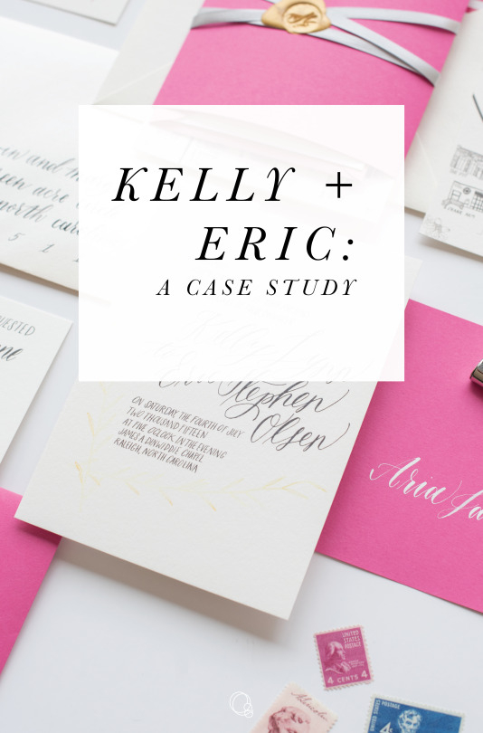
When Kelly came to us last year, she had a strong vision for her wedding. She was getting married on the Fourth of July, at the Merrimon-Wynne house in downtown Raleigh, and she did not want something themed, but she did want something hand lettered, fun, and with a hint of that southern classic charm. Her colors were fuchsia, with touches of gold and grey.
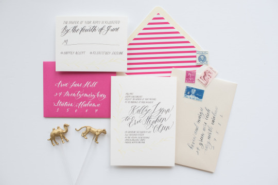
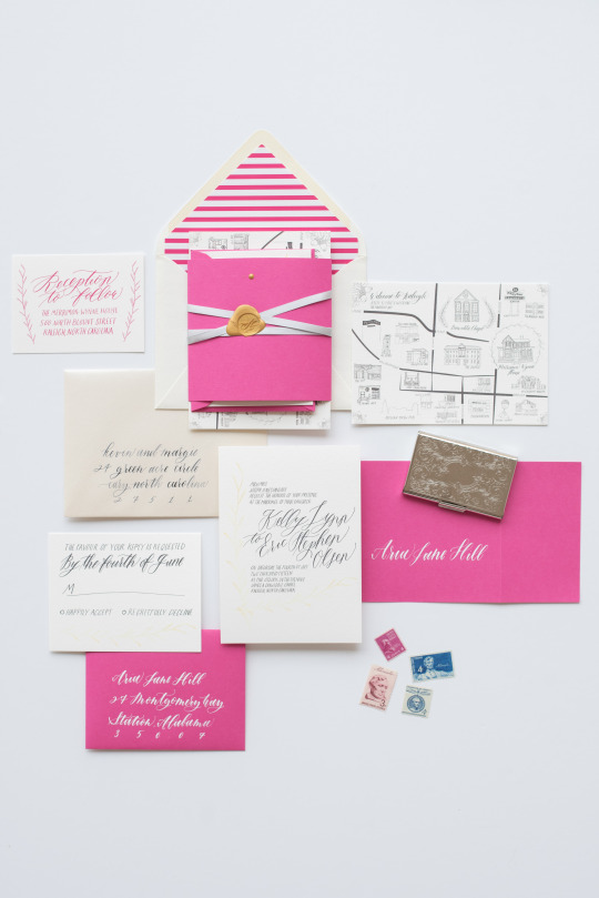
We decided to hand letter the entire invitation suite, and pair that with hand drawn illustrations in the map, and on the invitation itself. Pairing calligraphy with caps letters gave the invitation a whimsical feel, but didn’t introduce so many elements that it looked busy. We finished the invitation with a delicate vine printed in a golden yellow gradient, for a touch of gold. The map was the biggest part of the project - featuring 19 line drawings of some of Kelly and Eric’s favorite spots around Raleigh, it was a challenge to get everything on the page, but resulted in a artistic, illustrative addition to their suite.
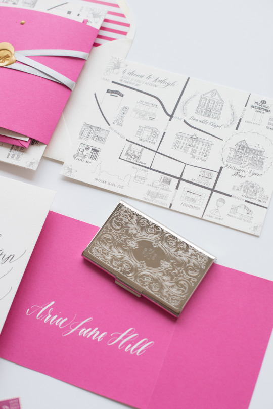
To introduce color, we added a classic striped envelope liner, paired with a cream envelope and gold calligraphy, a fuchsia reply envelope, and wide fuchsia belly band. Bridging the gap between the bright paper, and more subdued invitation cards was the hand lettered reception card, printed in the same bright pink.
Kelly and Eric were so lovely to work with, and it was so fun to see this all come together - since there has been such a trend toward more neutral colors, it was fun to step out of our comfort zone a bit and try something bright and fun!